Friday, 18 November 2011

Completion of Texture

So here's the finished product after a quick looking over on photoshop; I'm really quite happy with how this turned out, just simple editting helps bring out the intricacy of the negative spaces between the two layers. I used a similar image to the original base layer, just with a slight difference in angle which has created a bridging of the two images as they collide into eachother. Another aspect i'm pleased with, is how the two tones of purple and blue both compliment the other; as well as the combination of colours giving it a surreal effect. I'll definitely be using this process to develop ideas in the future.

Fairytale Forest? or Twisted Dream?


Motion

The aim of this image was to create textures / a textural image without directly taking a photo of a patterned object. This is only the first stage of the image, as i have yet to photoshop another layer ontop then to greatly alter the colour, but I love the how the shaking motion of the camera has created this 'grainy fisheyed' look, i think the quality of the image on it's own as a texture is quite interesting.

Autumn Leaves


Thursday, 13 October 2011

Combined Sculptures

Photography in Fine Art

Today we were expermenting with the combined use of the body and various objects to create sculptures. The idea was to explore the various styles of fine art, that it's not just paint and pencils; also that the use of photography as a media, can be used within a fine art context. The images were taken using a digital compact camera and edited using Photoshop CS5. For most of the photos i adjusted the shadows/highlights using the curves feature to give my images a much colder look; as well as changing the vibrance and saturation to help highlight individual focus points of the photos, e.g the kirtsie's orange gig band in the 4th photo.

My favourite thing about this image is the naturalness of kirsie's body language (despite being hung up!). As she's looking down and away from the camera suggests that the whole thing is not an accurately composed photo.


I really like the vibrance of the wristband in contrast to the saturation of the rest of the image.

I chose this image because of the composition of the objects, I like how they fit in with surrounding environments.. and kirstie!


Sunday, 2 October 2011

Rio


Chesterfield

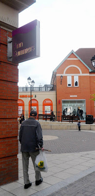
These are some shots of chesterfield I took for college, I selected these 5 images because I felt they gave an essence of the town from the locals perspective rather than the viewpoint of a tourist/passer by.

Roofline
   
Transit
 
 
Twilight Years

Never Too Old


Traffic


Monday, 19 September 2011

Olive Grove "Igloo"


I chose this photo as my main image as the "Igloo" Dome, is a well known landmark for Sheffield locals. The dome is quite representative of the area Heeley. I took it because I liked the way the light bounced off the surface of the building and the contrast of the darker shades with the clear sky.